We are a boutique IP firm located in Osaka, Japan, specializing in trademark, design, specific unfair competition and copyright matters.
EMAIL: info@okeno-ip.jp
No.006; Section 4-1-11: confusing similarity of lion emblems;
Opposition No. 2013-900046 (November 8, 2013)
Bottom line: The Board held the two lion emblems not similar and dismissed the
opposition.
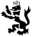
[Opposed mark]

[Earlier mark]

- Both marks consist of a lion-like silhouette
figure in a rampant position, tail raised and tongue stuck out.
[Different
elements]
- The lion-like figure of the opposed mark wears
a crown, while that of the earlier mark has stylized letters “sh” on its head.
- The opposed mark has 3 white lines in parallel
over its body and tail.
- The earlier
mark has an eyehole, and white space separates the body parts.
[Comparison]
- The difference of the appearance of the two
marks overweighs the similarity in the mind of the consumer. Therefore, the marks are visually
distinguishable. In addition, the marks are
not confusingly similar phonetically and semantically, because the marks merely
conjure an image of a lion-like animal, and do not identify a specific beast.
- Overall, the marks at issue are not
confusingly similar.
And so the Board dismissed the opposition.
バナースペース
Okeno IP Professionals
Dojima NS Bldg. 3F, 2-1-18, Dojima
Kita-ku, Osaka 530-0003 Japan
TEL: +81-6-6343-8401
FAX: +81-6-6343-8402
Email: info@okeno-ip.jp