We are a boutique IP firm located in Osaka, Japan, specializing in trademark, design, specific unfair competition and copyright matters.
EMAIL: info@okeno-ip.jp
No. 173; Section 4-1-11: confusing similarity refusal;
Reebok ROYAL FLAG v. ROYAL FLAG;
Appeal No. 2014-25616
(February 29, 2016)
Bottom line: The Board found that “Reebok ROYAL FLAG” logo is not confusingly similar to
“ROYAL FLAG” logo.
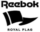
The applicant filed a
trademark application for “Reebok ROYAL FLAG” logo shown below designating
footwear, boots for sports, etc. in Class 25.
<Applied-for
mark>
<Cited
mark>
![]()
Both the applied-for
mark and the cited mark designate footwear.
So the question is whether the marks are confusingly similar or
not.
The Board observed the
marks and found as follows:
<As for the
applied-for mark>
The applied-for mark is
composed of “Reebok” in unique font, flag design and “ROYAL FLAG” in small
Gothic script. The mark as a whole is
pronounced [reebok royal flag]. “Reebok”
is well-known in Japan as the brand name of the applicant. So, the mark is also pronounced
[reebok]. The mark as a whole means “a
series of goods named “ROYAL FLAG” sold by Reebok”. Further, it also means “Reebok”. “ROYAL FLAG” is smaller than “Reebok”, and is
written in simple Gothic script.
Accordingly “ROYAL FLAG” does not create as dominant impression as
“Reebok”. Therefore, it is not proper to
extract “ROYAL FLAG” from the applied-for mark and compare it to the cited
mark. Rather, the applied-for mark as a
whole or “Reebok” extracted from it should be compared to the cited
mark.
<As for the cited
mark>
<Comparison>
<Actual
circumstances of the trading>
The applicant has
several bland names, i.e. “EASYTONE”, “PUMP”, “FREESTYLE”, “SKYSCAPE”, almost
all of which are used with “Reebok”.
And so the Board reversed the refusal, and granted registration of “Reebok
ROYAL FLAG” logo.
![]()
バナースペース
Okeno IP Professionals
Dojima NS Bldg. 3F, 2-1-18, Dojima
Kita-ku, Osaka 530-0003 Japan
TEL: +81-6-6343-8401
FAX: +81-6-6343-8402
Email: info@okeno-ip.jp